Part 2: Gaining Perspective With EMR Data Analytics
In part one of this series, I discussed the value of healthcare data analytics and the three pillars for a healthcare analytics strategy. In this post, I will move on to some of the uses for EMR data, and analytics tools to help.
I will specifically look at:
- MIPS
- Population Health Research
- Specialized Registries
One of the first challenges around data is compliance. Everyone considers – or should consider – items such as the Merit-based Incentive Payment System (MIPS). To summarize, MIPS compliance is graded on a curve, and it will have winners and losers – this will impact your bottom line. Within EMA , our specialty-specific EMR system, we have reporting sections which allow you to see how your doctors score component by component. You can track their progress on each individual MIPS measure and category, as well as their MIPS composite score.
Our MIPS comparison report allows you to look doctor by doctor at the different MIPS pieces and understand your physician’s score, but also the recalculated MIPS comparison for 2017. This is a benchmark against other providers in EMA, so you can not only compare providers within a practice, but also view the MIPS comparison to see how providers outside of your practice perform.
The most aggressive way to keep yourself on the positive side of the curve is to monitor your MIPS Quality and other MIPS component scores and try to angle them up to the higher end of the curve by exceeding your peers. Our MIPS comparison will show you where your entire practice is, where each of your doctors are and where you fall in the mix.
Our MIPS comparison is not specialty-specific, so it compares your performance against all 10,000 (and counting) providers around the country who use Modernizing Medicine.
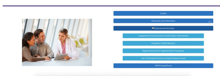
You can toggle among the big pieces of the MIPS picture: Quality, Advancing Care Information and Improvement Activities.
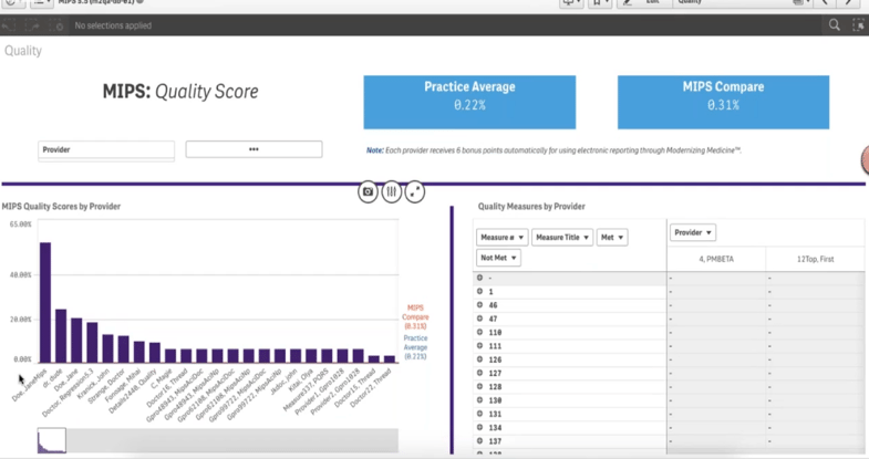
When you look at the Quality score, you can see all of your physicians listed at the bottom. You can then highlight a few of them to review in more detail. You can see the live MIPS compare URL, so you’ll be able to drill down measure by measure to look at each of your doctors’ performance rates. In our Analytics platform, you’ll be able to export this as a data table, image or PDF.
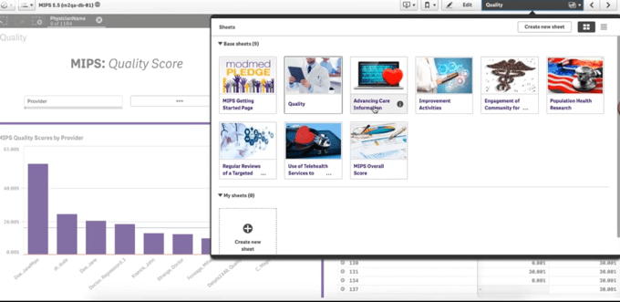
As you move through the app, you can look at the Quality scores in detail, as well as the Advancing Care Information, Improvement Activities and overall MIPS composite scores. You can complete some Improvement Activities from this app as well.
For instance, you can look at population health analytics as well as conduct regular reviews of targeted population activities. If you were to go through engagement of community for health status improvement, this may remind you that you can meet this by utilizing modmed Registries, Modernizing Medicine’s specialized registries within EMA.
Aside from meeting MIPS measures, you can also use our Analytics platform to conduct population health research. The Advanced Clinical Targeting report allows you to generate lists of included and excluded based patients on certain criteria, like a specific diagnosis, month or year seen, age, treatment plan and more.
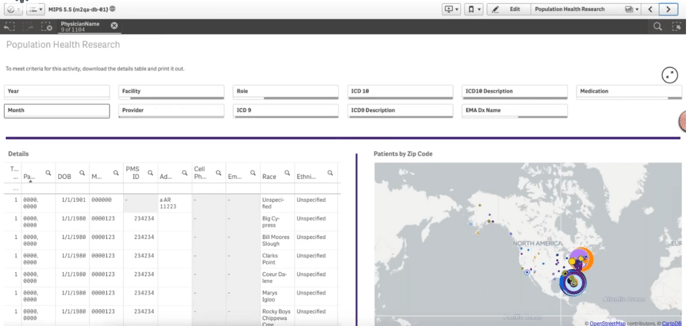
For example, let’s look at a diagnosis of acne. This allows you to see a targeted zip code picture, but also a complete patient list that is exportable as well to meet this criteria for this activity. You can also download the details in a table to print and put it in a file. And just like that, you’ve now completed population health research based on a particular diagnosis.
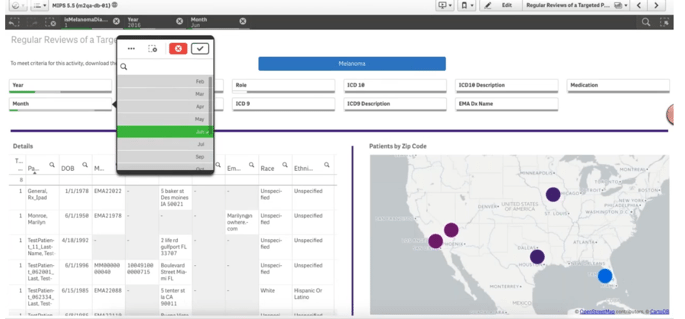
With our analytics platform, we take this one step further. From a dermatology aspect, you can look at the diagnosis of melanoma and create a patient list and a specific year or a specific month and then and download that list of patients with melanomas.
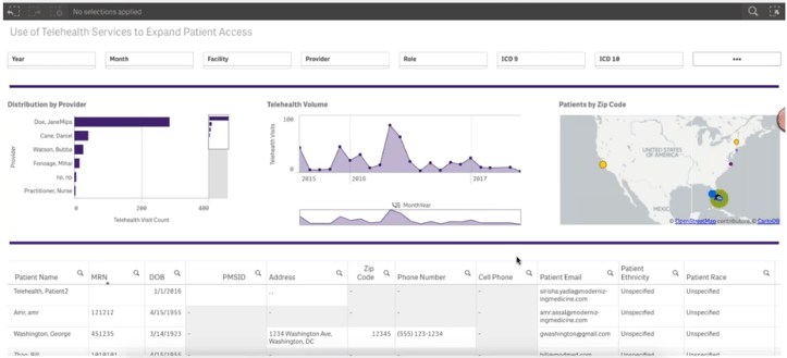
We have one more report being developed that will enable you to look at your dermatology telehealth services to expand patient access, which is a MIPS Improvement Activity. It allows you to look at your telehealth volume over time along with a detailed patient list. That’s the compliance piece, which gives more visibility within your practice. By being able to see this, you could potentially meet that Improvement Activity to help improve your MIPS score.
The Importance of Specialized Registries and EMR Analytics
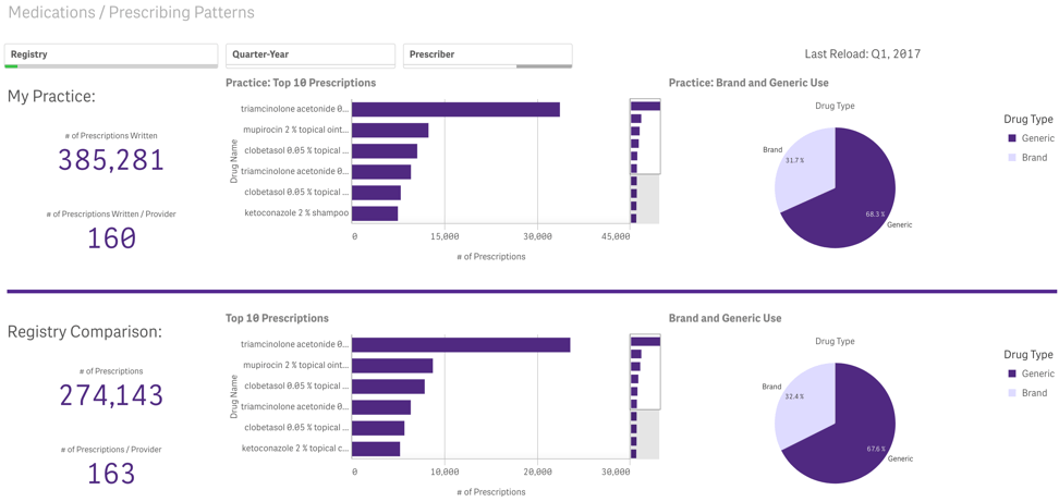
Next up are specialized registries. When you use our modmed Registries, you can look at your specialized registry patient lists right from EMA. Through the Analytics tab, you can view your data and comparisons for each. The dashboard allows you to see your practice’s data along with your practice’s top ten prescriptions and brand versus generic use. You can then compare your profile with the profile within the registry. Below you can see a registry example. You’ll be able to see how many prescriptions were written, the distribution of the top ten and the brand versus generic use.
In the next post, we will discuss our premium EMR Analytics solution including reporting and looking ahead to what’s next on the horizon. Read part one of this series on analytics here.
This post was originally published on September 14, 2017 updated on April 26, 2019.


